Hinge versus Tinder: Comparing Profile Formats for Better Matches
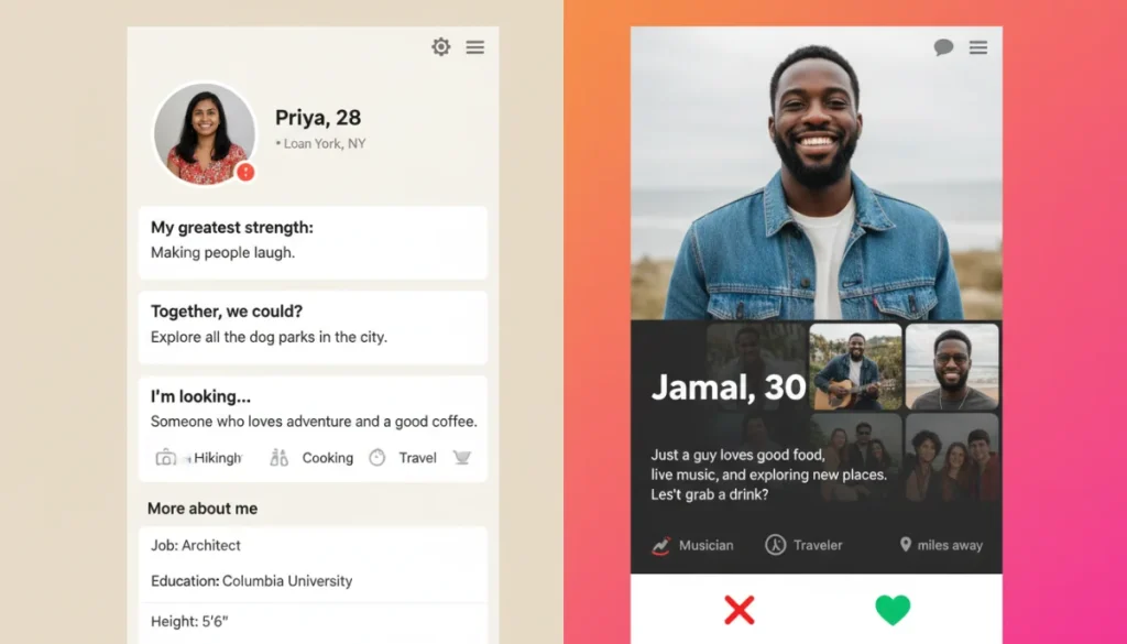
Understanding the distinct profile formats of Hinge and Tinder is crucial for users to navigate each app effectively, as their design philosophies directly impact how connections are initiated and developed.
When navigating the modern dating landscape, choosing the right platform can significantly influence your experience. The ongoing debate of Hinge versus Tinder: comparing profile formats isn’t just about app preference; it’s about understanding how fundamental design choices shape interaction, expectations, and ultimately, the potential for meaningful connections. Both apps aim to help you find a match, but their approaches to profile presentation are vastly different, catering to diverse user intentions and communication styles.
The Fundamental Design Philosophies
Hinge and Tinder, while both popular dating applications, operate on fundamentally different design philosophies that directly influence their profile formats. Tinder pioneered the swipe-based model, prioritizing speed and visual appeal, whereas Hinge emerged as the “relationship app,” focusing on deeper insights and conversational prompts. This core divergence dictates how users construct their profiles and how others interact with them.
Tinder’s design leans into immediate attraction and volume. Its profile structure is optimized for quick decisions, allowing users to rapidly assess potential matches based primarily on photos. This encourages a fast-paced environment where initial impressions are paramount. Conversely, Hinge aims to slow down the process, encouraging users to engage with more substantive information before making a decision. This distinction is critical for anyone looking to understand which app best suits their dating goals.
Tinder’s Visual-First Approach
Tinder’s profile format is largely visual-first. Users are prompted to upload several photos, which take center stage. The bio section is secondary, often brief, and sometimes overlooked in the initial swipe decision. This emphasis on imagery means that a compelling set of photos is crucial for success on Tinder.
- Photo-centric Display: Large, prominent photos dominate the screen, making visual appeal the primary driver for a swipe.
- Concise Bios: The bio field is limited, encouraging users to be brief and to the point, often relying on humor or a few key interests.
- Quick Decision-Making: The swipe left/right mechanic is designed for rapid assessment, leading to a higher volume of matches but potentially less initial context.
The success of a Tinder profile often hinges on the quality and variety of its photos. Users typically showcase their best angles, hobbies, and social life through a curated selection of images, with text serving as a supplementary detail rather than a primary engagement point.
Hinge’s Prompt-Driven Engagement
Hinge, on the other hand, embraces a prompt-driven model. Users are required to answer several icebreaker questions, known as “prompts,” which are integrated directly into their profiles alongside photos. This structure encourages more thoughtful responses and provides ample conversational hooks.
The prompts on Hinge are designed to reveal personality and interests beyond superficial aesthetics. They range from lighthearted questions about favorite travel memories to more introspective inquiries about life goals. This ensures that every profile offers multiple points of entry for conversation, fostering a more deliberate and potentially deeper connection from the outset.
The fundamental design philosophies of Hinge and Tinder create distinct user experiences, each with its own advantages and disadvantages depending on what a person seeks from an online dating platform. Understanding these core differences is the first step in optimizing your approach to either app.
Crafting Your Profile: Content and Strategy
The type of content you create for your profile and the strategy you employ will vary significantly between Hinge and Tinder, primarily due to their differing profile formats. A successful profile on one app might not translate directly to success on the other without adaptation. This section explores how to best approach content creation and strategy for each platform.
Optimizing Your Tinder Profile
For Tinder, the strategy revolves around making a strong visual impact quickly. Your photos are your primary tool for attracting attention. It’s advisable to use a mix of high-quality photos that showcase your personality, hobbies, and social life. The first photo should be a clear, smiling headshot, while subsequent photos can illustrate your interests.
- Photo Selection: Prioritize clear, diverse, and recent photos. Include a full-body shot and images that show you engaged in activities.
- Bio Brevity: Keep your bio short, witty, and intriguing. Use a hook or a question to encourage engagement, but don’t overthink it, as many users may not read it thoroughly.
- Verification Badges: Utilize any verification features (e.g., photo verification) to build trust and credibility.
Many users on Tinder appreciate directness and a sense of humor in the bio. Avoiding overly long or generic statements can help you stand out. The goal is to make a positive impression within seconds, prompting a right swipe.
Building an Engaging Hinge Profile
Hinge requires a more thoughtful and detailed approach. The prompts are the cornerstone of your profile, offering opportunities to display your personality, humor, and values. Choosing the right prompts and crafting genuine, insightful answers is paramount.
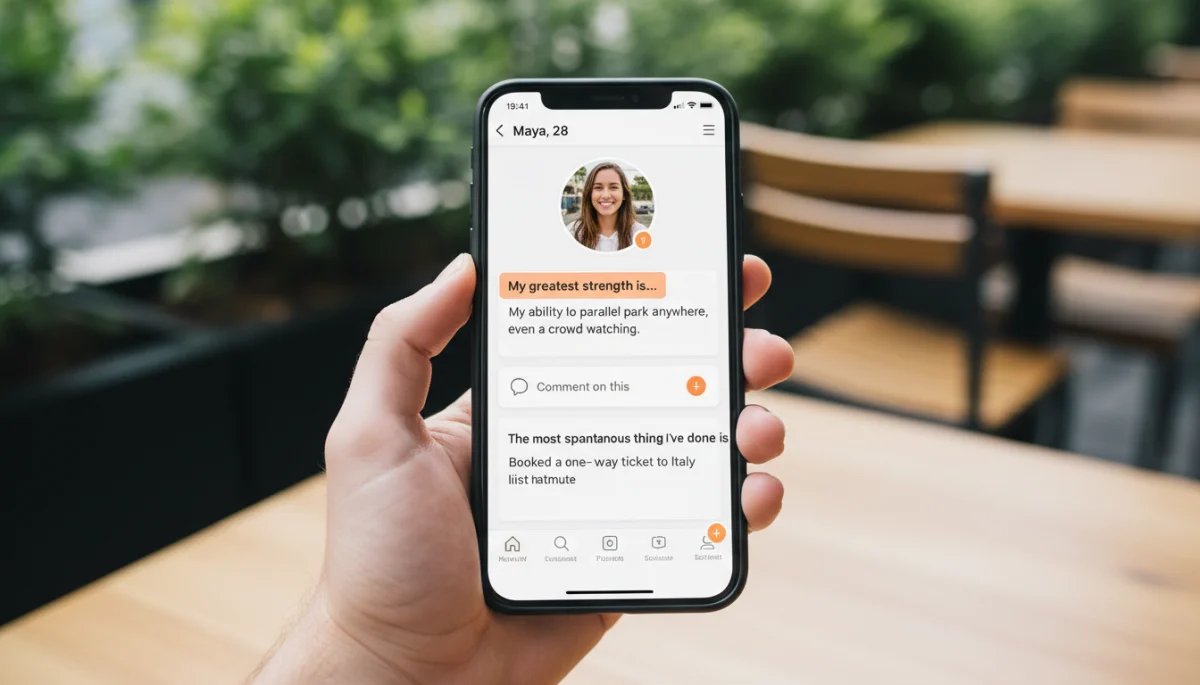
Beyond prompts, Hinge allows you to showcase more about your lifestyle, including your job, education, political views, and family plans. This additional context helps users make more informed decisions and provides more avenues for starting conversations. The strategy here is to create a well-rounded and authentic representation of yourself.
- Thoughtful Prompt Answers: Choose prompts that allow you to express unique aspects of your personality. Avoid generic answers and aim for specificity and humor.
- Diverse Photos with Captions: While photos are important, Hinge also allows captions, which can add context or a touch of humor, further enhancing your profile.
- Detailed Information: Fill out as many sections as possible to provide a comprehensive view of who you are and what you’re looking for.
The content and strategy for Hinge profiles are geared towards initiating more meaningful interactions. By providing more information upfront, users can engage in more substantive conversations, moving beyond superficial judgments.
Interaction Dynamics: Swiping vs. Commenting
The way users interact with profiles on Hinge and Tinder is a direct consequence of their profile formats, leading to distinct interaction dynamics. Tinder’s swipe culture encourages quick, often superficial judgments, while Hinge’s commenting system fosters more deliberate and personalized engagement. Understanding these dynamics is crucial for setting expectations and adapting your communication style.
Tinder’s Swipe-Based Engagement
Tinder’s iconic swipe left (no interest) or swipe right (interested) mechanism has revolutionized online dating. This system is incredibly efficient for sifting through a large volume of profiles, but it also means that initial engagement is often based on a split-second decision. The focus is primarily on visual appeal, and mutual likes are required before any conversation can begin.
The rapid-fire nature of swiping can lead to what some call “swipe fatigue,” where users become desensitized to profiles and make decisions without much thought. Conversations, when they do happen, often start with generic greetings, and it can be challenging to stand out in a crowded inbox. The challenge on Tinder is not just getting a match, but converting that match into a meaningful conversation.
Hinge’s Commenting and Liking System
Hinge takes a different approach by allowing users to comment on specific elements of a profile, such as a photo or a prompt answer, before matching. This feature encourages more thoughtful engagement and provides an immediate conversation starter. Instead of a simple swipe, users can send a like with a personalized message, showing genuine interest in a particular aspect of the other person’s profile.
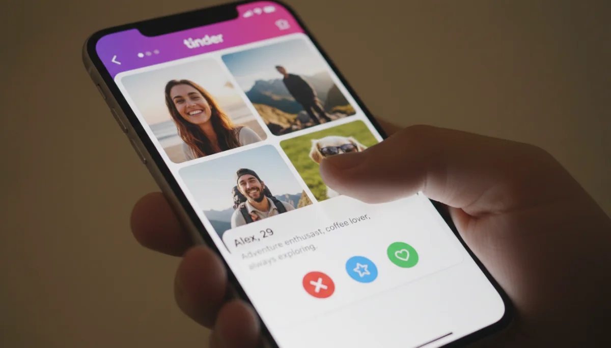
This commenting system means that every interaction has the potential to be more intentional. It forces users to pay closer attention to the details of a profile, rather than just its overall aesthetic. The quality of initial messages on Hinge tends to be higher, as they are often tailored to specific content within the profile, making it easier to start a relevant and engaging conversation.
The distinct interaction dynamics of Hinge and Tinder cater to different preferences. Tinder suits those who enjoy a fast-paced environment and visual-first interactions, while Hinge appeals to users who prefer a more deliberate, conversational approach with a higher emphasis on personalized engagement.
The Impact on Match Quality and Intentions
The differing profile formats and interaction dynamics of Hinge and Tinder inevitably impact the perceived quality of matches and the underlying intentions of their user bases. While neither app guarantees a “better” match, their structures tend to attract users with specific dating goals, which in turn influences the overall experience on each platform.
Tinder’s Broad Appeal and Varied Intentions
Tinder’s massive user base and accessible swipe mechanics mean it attracts a wide spectrum of intentions, from casual hookups and friendships to serious relationships. This broad appeal can be both a strength and a weakness. While it offers a large pool of potential matches, it also means that users may need to be more explicit about their intentions to find compatible partners.
The emphasis on quick decisions and visual attraction can sometimes lead to matches that lack depth or shared interests beyond initial physical chemistry. Users often report spending considerable time sifting through profiles to find individuals whose intentions align with their own. However, for those seeking a diverse range of connections or casual encounters, Tinder’s format can be highly effective.
Hinge’s Focus on Intentional Dating
Hinge, by design, positions itself as the app for those seeking more serious relationships. Its detailed profiles and prompt-driven interactions encourage users to invest more effort into their profiles and initial communications. This higher barrier to entry tends to filter out users who are primarily interested in casual encounters, leading to a user base with generally more intentional dating goals.
The ability to comment on specific profile elements before matching allows for a more curated and thoughtful initiation of contact. This often results in higher-quality initial conversations, as both parties have already demonstrated a level of interest beyond a simple swipe. Many users find that matches on Hinge are more likely to lead to substantive dates and potentially long-term relationships due to this intentional design.
Ultimately, the impact on match quality and intentions is a reflection of each app’s design choices. Tinder’s broad accessibility fosters a diverse user base with varied goals, while Hinge’s structured engagement attracts those seeking more serious and deliberate connections.
Privacy and Data on Each Platform
Understanding how Hinge and Tinder handle user privacy and data is an increasingly important consideration for anyone using dating apps. Both platforms collect a significant amount of personal information, but their approaches to privacy settings, data usage, and user control can differ. These differences can influence a user’s comfort level and their overall sense of security while using the apps.
Tinder’s Data Practices
Tinder, as part of the Match Group, collects a wide array of data, including location, messaging content, interactions, and profile information. While Tinder states that it uses this data to improve its services and provide personalized matches, concerns about data privacy have been raised by various privacy advocates. Users can manage some privacy settings, such as location sharing, but the extent of data collection remains substantial.
- Extensive Data Collection: Gathers location, message content, usage patterns, and profile details.
- Targeted Advertising: Data is used for internal analytics and may inform targeted advertising both within and outside the app.
- Privacy Settings: Offers options to control location access and certain visibility features, but users have limited control over broader data usage.
Users should be aware that their data, even if anonymized, contributes to Tinder’s algorithms and business model. Regularly reviewing privacy policies and adjusting in-app settings can help mitigate some concerns, but a complete opt-out from data collection is generally not possible while using the service.
Hinge’s Privacy Approach
Hinge, also owned by Match Group, shares many similarities with Tinder in terms of data collection. However, Hinge often emphasizes its commitment to helping users find relationships and, as such, frames its data usage around improving match quality and user experience. While extensive, Hinge’s data collection is often perceived as being more directly tied to its core mission of facilitating connections.
Hinge provides users with options to control who sees their profile, including features like “Most Compatible” which uses algorithms based on user data to suggest matches. While this can enhance the user experience, it still relies on significant data processing. Hinge also allows users to request a copy of their data, providing a degree of transparency.
- Relationship-Focused Data Use: Data collection is often framed around enhancing match compatibility and user experience for serious relationships.
- Granular Profile Control: Users have more control over who sees specific parts of their profile and who they interact with.
- Data Transparency: Offers tools for users to request and review the data collected about them.
Both apps, being part of the same parent company, have similar foundational privacy policies. However, Hinge’s emphasis on intentional dating might lead to a perception of more responsible data use, as it is directly linked to facilitating deeper connections rather than just volume of interactions. Users on both platforms are encouraged to be proactive in managing their privacy settings and understanding the implications of sharing personal information.
User Experience and Interface Navigation
The overall user experience (UX) and how one navigates the interface are critical factors that differentiate Hinge and Tinder. These elements directly influence how enjoyable and efficient the dating process feels. While both apps are designed to be intuitive, their distinct interfaces cater to different user preferences and interaction styles.
Tinder’s Streamlined Interface
Tinder is renowned for its simple, streamlined interface. The core functionality revolves around swiping, making it incredibly easy to learn and use. The visual layout is clean, with profiles taking up the majority of the screen, ensuring that photos are the primary focus. Navigation is minimal, typically involving a few icons at the bottom for accessing messages, your profile, and preferences.
This minimalist design contributes to its widespread appeal, as it removes barriers to entry and allows for quick, low-commitment interactions. The instant gratification of a match and the ease of browsing make Tinder a highly addictive platform for many users. However, this simplicity can sometimes come at the cost of depth, as detailed information is less immediately accessible.
Hinge’s Detailed and Interactive UI
Hinge’s interface, while still user-friendly, is designed to encourage more thoughtful engagement. Profiles are structured vertically, allowing users to scroll through photos, prompts, and personal details. The ability to comment on specific elements is seamlessly integrated, making it easy to initiate a personalized interaction. The layout feels less like a game and more like a social media feed, inviting users to pause and read.
The app also features a “Discover” tab, which presents a curated selection of profiles based on your preferences, encouraging users to explore potential matches more deliberately. This interactive and detailed UI fosters a sense of intentionality, aligning with Hinge’s goal of facilitating serious relationships. The navigation might require a few more taps than Tinder, but it’s designed to provide more information and context.
In summary, Tinder offers a fast, visually driven, and straightforward user experience, ideal for quick browsing and high-volume interactions. Hinge, conversely, provides a more detailed, interactive, and intentional interface, encouraging deeper engagement and thoughtful connections. The choice between them often comes down to personal preference for speed versus depth in the dating app experience.
Choosing the Right App for Your Dating Goals
Deciding between Hinge and Tinder ultimately comes down to aligning the app’s design and user base with your personal dating goals. Both platforms offer unique advantages, and understanding these can help you make an informed choice that optimizes your online dating journey. There isn’t a universally “better” app; rather, there’s the app that’s better for you.
When Tinder Might Be Your Best Bet
Tinder is often the preferred choice for individuals who prioritize a broad reach and a fast-paced dating experience. If you are open to various types of connections, from casual encounters to potential long-term relationships, and enjoy the efficiency of visual-first matching, Tinder could be highly effective. It’s also ideal if you appreciate a large user pool and the thrill of immediate gratification from mutual likes.
- Casual Dating: Excellent for those seeking casual connections, friendships, or exploring various options without immediate commitment.
- High Volume of Matches: If you enjoy having a large pool of potential matches and a rapid swiping experience.
- Visual Preference: For users who primarily make initial judgments based on photos and prefer a quick assessment process.
Tinder’s widespread popularity means you’ll likely find a diverse range of people, and its straightforward interface makes it easy to jump right into the dating scene. It’s a great platform for honing your initial attraction skills and learning what works for you visually.
When Hinge Aligns with Your Objectives
Hinge is generally recommended for those who are seeking more serious, intentional relationships. Its design encourages users to invest more effort into creating detailed profiles and engaging in thoughtful interactions. If you value personality, shared interests, and deeper conversations over superficial swiping, Hinge is likely to be a more rewarding experience.
- Serious Relationships: Geared towards individuals looking for meaningful, long-term partnerships.
- Detailed Profiles: If you prefer to learn more about a person’s personality, values, and interests before matching.
- Quality Over Quantity: For users who prioritize fewer, more intentional matches and conversations over a high volume of interactions.
The prompt-based system and the ability to comment on specific profile elements on Hinge foster a more organic and personalized approach to dating. It helps users bypass generic small talk and dive into more substantive discussions, increasing the likelihood of finding a truly compatible partner.
Ultimately, the best app for you depends on what you’re looking for. Consider your dating intentions, how much effort you’re willing to put into your profile, and what kind of interactions you prefer. Both Hinge and Tinder offer viable paths to connection, but their distinct approaches cater to different journeys.
| Feature | Description |
|---|---|
| Profile Format | Tinder is photo-centric with brief bios; Hinge uses prompts and detailed bios. |
| Interaction Style | Tinder uses quick swiping; Hinge allows commenting on specific profile elements. |
| Dating Intentions | Tinder caters to varied intentions; Hinge focuses on serious relationships. |
| User Experience | Tinder offers a streamlined, fast UI; Hinge provides a detailed, interactive UI. |
Frequently Asked Questions About Hinge and Tinder
Hinge is generally considered better for serious relationships due to its prompt-driven profiles and emphasis on thoughtful engagement. Its design encourages users to share more about their personality and intentions, leading to more intentional connections and conversations.
Yes, many people use both Hinge and Tinder simultaneously to maximize their dating opportunities. Each app caters to different interaction styles and user bases, so using both can broaden your reach and help you determine which platform aligns best with your preferences.
Tinder profiles are heavily photo-centric, prioritizing visual appeal with large images and minimal text. Hinge integrates photos with prompts, allowing for captions and encouraging users to showcase personality alongside their visuals, fostering a more balanced profile.
Both Hinge and Tinder collect extensive user data as they are owned by the same parent company. While Hinge’s focus on intentional dating might suggest a more privacy-conscious approach, users should review the privacy policies of both apps and adjust their settings accordingly for optimal control over their personal information.
On Tinder, conversations begin only after a mutual swipe right, often with generic openers. Hinge allows users to send a like with a comment on a specific photo or prompt, providing an immediate, personalized conversation starter that often leads to more engaging initial interactions.
Conclusion
The choice between Hinge and Tinder hinges significantly on understanding their distinct profile formats and the underlying philosophies that drive them. While Tinder excels in providing a rapid, visually-driven experience for a broad spectrum of dating intentions, Hinge fosters deeper connections through its prompt-based profiles and thoughtful interaction system. By carefully considering your personal dating goals and preferred communication style, you can leverage the strengths of either app to enhance your online dating journey and increase your chances of finding a compatible match.
