How to Adjust Text Size for Comfortable Messaging

Mastering how to adjust text size and readability in your messaging apps and device settings is crucial for a comfortable and personalized digital communication experience, preventing eye strain and enhancing comprehension.
In our increasingly digital world, communication often happens through screens, making the ability to adjust text size and readability for more comfortable messaging not just a convenience, but a necessity. Whether you’re catching up with family, coordinating with colleagues, or engaging in new online communities, ensuring your messages are easy on the eyes can significantly enhance your overall experience and reduce digital fatigue.
Understanding the Importance of Text Readability in Messaging
Text readability is far more than just about avoiding squinting; it’s a fundamental aspect of digital accessibility and personal comfort. Poor text readability can lead to eye strain, headaches, and even reduced comprehension, turning everyday messaging into a frustrating chore. Optimizing text display ensures that your digital interactions are efficient and enjoyable, regardless of your visual acuity or screen size.
Many factors contribute to how readable text appears on a screen. These include font size, font style, line spacing, contrast between text and background, and even the device’s screen resolution. While some of these are controlled by app developers, many critical settings are directly within your control, allowing for a personalized viewing experience that caters to your specific needs.
The Impact of Font Size on Eye Health
The size of the text you read directly affects how much effort your eyes exert. Smaller fonts force your eyes to work harder to distinguish individual characters, leading to faster fatigue. Conversely, overly large fonts can reduce the amount of text visible on the screen, requiring more scrolling and potentially breaking the flow of reading.
- Reduced eye strain and fatigue.
- Improved focus and concentration.
- Enhanced comprehension of messages.
- Better overall digital well-being.
Finding the right balance is key. What might be comfortable for one person could be too small or too large for another. This is precisely why customization options are so important, empowering users to tailor their messaging environment to their unique preferences and needs. Prioritizing text readability is a proactive step towards a healthier and more productive digital life.
Adjusting Text Size on Your Mobile Device: System-Wide Settings
Before diving into individual apps, it’s often most effective to start with your device’s system-wide settings. Both iOS and Android offer robust accessibility features that allow you to adjust text size, and sometimes even text weight, across most applications. This approach ensures a consistent reading experience, rather than needing to tweak settings in every single app you use.
These system-level adjustments are powerful because they apply broadly. When you increase the font size in your phone’s settings, most compatible apps—including your favorite messaging platforms—will automatically adapt. This creates a more uniform and comfortable visual environment, reducing the need for constant manual adjustments.
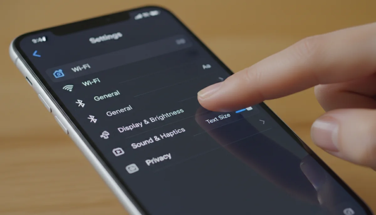
Adjusting these settings is usually straightforward, typically found within the ‘Display’ or ‘Accessibility’ sections of your phone’s main settings menu. Experimenting with different levels will help you find the optimal size that suits your vision and preferences.
For iOS Devices (iPhone/iPad)
Apple’s iOS offers a feature called ‘Dynamic Type,’ which allows apps to automatically adjust their text to your preferred size. This ensures a cohesive experience across the operating system and supporting applications.
- Go to ‘Settings’ > ‘Display & Brightness’ > ‘Text Size’.
- Drag the slider to increase or decrease the font size.
- For even larger text, go to ‘Settings’ > ‘Accessibility’ > ‘Display & Text Size’ > ‘Larger Accessibility Sizes’.
These settings are incredibly useful for users who require significant text enlargement. The ‘Larger Accessibility Sizes’ option provides an extended range beyond the standard text size slider, catering to those with more pronounced visual needs.
For Android Devices
Android devices also provide comprehensive options for text customization, though the exact path might vary slightly depending on your phone’s manufacturer and Android version.
- Navigate to ‘Settings’ > ‘Display’ > ‘Font size and style’ or ‘Display size and text’.
- Use the slider to adjust the font size. Some Android versions also allow you to change the display size, which scales all elements on the screen, including text.
- Look for ‘Accessibility’ settings for additional options like high-contrast text or bold text, which can further improve readability.
Remember that a system-wide change affects almost every app, so it’s a great starting point for improving your overall digital experience. Always restart any open messaging apps after making these changes to ensure they take effect immediately.
App-Specific Text Size Settings: Tailoring Your Messaging Experience
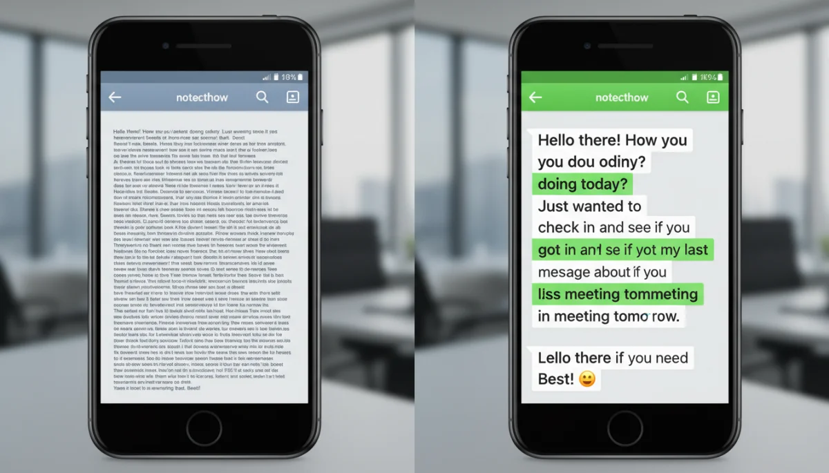
While system-wide settings are powerful, some messaging apps offer their own internal text size adjustments. These app-specific controls can be incredibly useful if you prefer a different text size in one particular app compared to the rest of your device, or if an app doesn’t fully respect your system’s accessibility settings. This granular control allows for a truly customized messaging environment.
These settings usually live within the app’s ‘Settings’ or ‘Preferences’ menu, often under ‘Chat Settings,’ ‘Display,’ or ‘Accessibility.’ Taking the time to explore these options within your most frequently used messaging applications can significantly improve your comfort and efficiency during conversations. It’s about fine-tuning your digital workspace to your exact specifications.
WhatsApp Text Size Adjustment
WhatsApp, one of the most popular messaging apps globally, provides its own text size options, separate from system settings. This allows users to set a specific text size just for their WhatsApp chats.
- Open WhatsApp > Go to ‘Settings’ (iOS) or ‘More options’ (Android).
- Select ‘Chats’ > ‘Font Size’.
- Choose between ‘Small,’ ‘Medium,’ or ‘Large.’
This dedicated setting is excellent for users who might want larger text in their WhatsApp conversations but prefer standard text size for other applications on their device. It offers flexibility without requiring a complete system overhaul.
Facebook Messenger Text Settings
Facebook Messenger generally adheres to your device’s system-wide text size settings. However, there are other display options that can indirectly improve readability.
- Messenger doesn’t have a direct in-app font size setting.
- Ensure your device’s system-wide text size is adjusted as described previously.
- Consider using ‘Dark Mode’ within Messenger (‘Settings’ > ‘Dark Mode’) to improve contrast, which can significantly enhance readability for some users, especially in low-light conditions.
While a direct font size slider is absent, leveraging system settings and Messenger’s dark mode can still provide a more comfortable viewing experience. This highlights the importance of understanding both system and app-specific capabilities.
iMessage and Telegram
Both iMessage (for Apple users) and Telegram typically follow the system-wide text size settings of your device. This means that changes made in your phone’s main accessibility or display settings will automatically reflect in these apps.
- For iMessage, adjust text size via iOS ‘Settings’ > ‘Display & Brightness’ > ‘Text Size’.
- Telegram also respects system settings. Additionally, Telegram offers theme customization which can impact background and text colors, indirectly affecting readability.
The adherence to system settings in these apps simplifies the customization process, as a single adjustment can impact multiple applications. This consistency is often appreciated by users who prefer a uniform experience.
Beyond Size: Enhancing Overall Readability
Adjusting text size is a significant step, but readability encompasses more than just dimension. Several other factors contribute to how easily and comfortably you can read text on a screen. Exploring these additional settings can provide a holistic improvement to your messaging experience, addressing nuances that a simple size adjustment might miss.
These enhancements often involve contrast, display mode, and even specialized accessibility features designed to cater to various visual needs. Combining these options with appropriate text sizing creates an optimal reading environment, reducing strain and making digital communication genuinely enjoyable. It’s about creating a visual ecosystem that works best for you.
Contrast and Color Schemes
The contrast between text and its background plays a crucial role in readability. High contrast (e.g., dark text on a light background, or vice versa) generally makes text easier to discern, especially for individuals with certain visual impairments or in challenging lighting conditions.
- Dark Mode: Many apps and operating systems offer a ‘Dark Mode’ or ‘Night Mode.’ This typically switches the interface to a dark background with light text. For some, this reduces eye strain, especially in low-light environments, by lowering overall screen brightness.
- High Contrast Text: Some devices and apps offer an option for ‘High Contrast Text’ within their accessibility settings. This feature enhances the contrast of text elements, making them stand out more prominently against their background.
Experimenting with dark mode and high contrast settings can reveal what works best for your eyes. What’s comfortable for one person might not be for another, so personal exploration is key to finding your optimal display settings.
Font Styles and Weight
While direct font style changes are less common in messaging apps, some operating systems allow for bolding text system-wide, which can improve character definition.
- System Font Weight: Check your device’s accessibility or display settings for options like ‘Bold Text.’ This can make all text on your device, including in messaging apps, appear bolder and often easier to read.
- Legible Fonts: While you can’t usually change the font face in messaging apps, developers generally choose highly readable default fonts. Avoid apps that use overly decorative or thin fonts if readability is a priority.
Bolding text can be particularly helpful for distinguishing characters and making words pop, especially on smaller screens. It’s a subtle but effective way to boost legibility without drastically altering the overall interface.
Desktop and Web-Based Messaging Readability
Messaging isn’t confined to mobile devices; many people use web-based versions of apps like WhatsApp Web, Messenger, or Telegram Desktop. These platforms offer their own set of tools for adjusting text size and enhancing readability, often leveraging browser features.
Understanding how to manipulate these settings in your web browser or desktop application ensures a consistent and comfortable messaging experience across all your devices. The principles remain similar to mobile: reducing eye strain and improving comprehension are the primary goals, but the methods of adjustment differ.
Browser Zoom Functions
The most straightforward way to adjust text size on web-based messaging platforms is through your web browser’s built-in zoom functionality. This scales the entire webpage, including text, images, and interface elements.
- Keyboard Shortcuts: Most browsers use `Ctrl +` (Windows) or `Cmd +` (Mac) to zoom in, and `Ctrl -` (Windows) or `Cmd -` (Mac) to zoom out. `Ctrl 0` or `Cmd 0` typically resets the zoom to default.
- Browser Settings: You can also find zoom options in your browser’s settings menu, usually under ‘Appearance’ or ‘Zoom.’ This allows for more precise control and the ability to set a default zoom level for all websites or specific ones.
Browser zoom is incredibly versatile, allowing you to instantly adapt the viewing experience of any web-based messaging interface. It’s a quick and effective solution for immediate readability improvements.
Desktop Application Settings
Dedicated desktop applications for messaging (e.g., WhatsApp Desktop, Telegram Desktop) often have their own internal settings for text size, similar to their mobile counterparts.
- In-App Preferences: Look for ‘Settings’ or ‘Preferences’ within the desktop app itself. There you might find options for ‘Chat Settings,’ ‘Display,’ or ‘Accessibility’ where you can adjust font size.
- Operating System Scaling: On Windows or macOS, you can adjust the overall display scaling, which affects the size of all elements, including text, across all applications. This is a system-wide change that can also impact desktop messaging apps.
Leveraging both in-app settings and operating system scaling provides comprehensive control over text readability on your computer. This dual approach ensures that you can fine-tune your desktop messaging environment to your exact visual requirements.
Advanced Readability Features and Accessibility Tools
Beyond basic text size and contrast, modern operating systems and some messaging apps offer advanced accessibility features designed to assist users with specific visual needs. These tools go a step further in making digital communication inclusive and comfortable for everyone.
These advanced options demonstrate a growing commitment by technology providers to universal design principles, ensuring that their products are usable by the widest possible audience. Exploring these features can unlock new levels of comfort and functionality, especially for those who find standard adjustments insufficient.
Screen Readers and VoiceOver/TalkBack
For users with significant visual impairments, screen readers are indispensable. These tools read aloud the text and elements on the screen, allowing users to navigate and interact with messaging apps audibly.
- iOS VoiceOver: Found in ‘Settings’ > ‘Accessibility’ > ‘VoiceOver.’ It provides spoken descriptions of items on the screen.
- Android TalkBack: Located in ‘Settings’ > ‘Accessibility’ > ‘TalkBack.’ Similar to VoiceOver, it offers spoken feedback.
While not directly adjusting text size, screen readers fundamentally transform how text is consumed, making messaging accessible to a broader range of users. They represent a critical layer of accessibility technology.
Magnifier and Zoom Functions
Both iOS and Android offer screen magnification tools that allow you to zoom in on specific parts of the screen, effectively enlarging any text or image.
- iOS Zoom: ‘Settings’ > ‘Accessibility’ > ‘Zoom.’ You can magnify the entire screen or a specific window.
- Android Magnification: ‘Settings’ > ‘Accessibility’ > ‘Magnification.’ Allows you to temporarily magnify parts of the screen by triple-tapping.
These magnification tools are excellent for temporary needs, such as reading fine print or focusing on a particular message without changing system-wide text settings. They provide on-demand visual assistance.
Text-to-Speech (TTS) for Messages
Many devices and apps can convert written messages into spoken audio, offering an alternative way to consume content, especially useful when your eyes are fatigued or occupied.
- System-wide TTS: Most operating systems have a ‘Speak Screen’ or ‘Select to Speak’ feature that can read out highlighted text.
- App Integrations: Some messaging apps might integrate with these system features, allowing you to have messages read aloud directly from the chat interface.
TTS is a fantastic feature for hands-free or eyes-free consumption of messages. It adds another dimension to accessibility, ensuring that information can be received in a format that best suits the user’s current situation or preference.
Maintaining Digital Eye Health While Messaging
Adjusting text size and readability settings is a vital part of maintaining digital eye health, but it’s not the only factor. A holistic approach to screen time and visual comfort involves several other practices that can significantly reduce strain and improve your overall well-being. Incorporating these habits into your daily routine can make a profound difference.
Beyond the technical adjustments, mindful usage and environmental considerations play a crucial role. By combining optimized settings with healthy habits, you can create a sustainable and comfortable digital messaging experience that supports your long-term eye health. It’s about proactive care and conscious interaction with your devices.
The 20-20-20 Rule
This simple rule is highly effective in preventing digital eye strain. For every 20 minutes spent looking at a screen, look away at something 20 feet away for 20 seconds. This helps your eyes refocus and relax.
- Set a timer or use an app to remind you.
- Focus on a distant object, out a window, or across the room.
- Blink frequently during the break to keep your eyes moist.
Adhering to the 20-20-20 rule is a small habit that yields significant benefits, reducing fatigue and maintaining ocular comfort throughout your day.
Proper Lighting and Screen Position
Your environment significantly impacts how your eyes perceive screen content. Poor lighting or an awkward screen position can exacerbate eye strain, even with optimized text settings.
- Adequate Lighting: Ensure your room is well-lit, but avoid glare on your screen. Position your screen so that light sources (windows, lamps) are not directly behind or in front of it.
- Ergonomic Setup: Position your screen at arm’s length, with the top of the screen at or slightly below eye level. This helps maintain a comfortable neck and head posture.
Optimizing your physical environment complements digital settings, creating a comprehensive strategy for eye health. It’s about harmonizing your tech with your surroundings.
Regular Eye Check-ups
Even with the best settings and habits, regular eye check-ups are indispensable. An optometrist can detect underlying vision issues and provide personalized advice for digital eye care.
- Schedule annual comprehensive eye exams.
- Discuss your screen time habits and any symptoms of eye strain with your eye care professional.
- They may recommend specific blue light filtering glasses or other solutions.
Professional guidance is the cornerstone of long-term eye health, ensuring that any potential issues are addressed promptly and effectively. It provides peace of mind and tailored solutions for your unique visual needs.
| Key Adjustment | Benefit for Readability |
|---|---|
| System Text Size | Applies consistent text enlargement across most device applications. |
| App-Specific Settings | Allows fine-tuning text size within individual messaging platforms like WhatsApp. |
| Contrast & Dark Mode | Reduces eye strain by optimizing the visual difference between text and background. |
| Browser Zoom | Scales entire web pages, including text, for desktop messaging clients. |
Frequently Asked Questions About Text Readability
Adjusting text size is crucial for preventing eye strain, reducing fatigue, and improving comprehension during digital communication. It ensures a more comfortable and accessible messaging experience, especially for prolonged screen time or individuals with varying visual needs.
Most modern messaging apps are designed to respect your device’s system-wide text size settings. However, some apps, like WhatsApp, offer their own in-app font size options that can override or complement the system settings for a more granular control over text display.
Dark Mode switches the interface to a dark background with light text. This can improve readability by reducing overall screen brightness and enhancing contrast, which is particularly beneficial in low-light environments and for individuals sensitive to bright screens.
Direct font style changes are rarely available within messaging apps themselves. However, some operating systems offer system-wide options like ‘Bold Text’ in accessibility settings, which can subtly enhance the legibility of text across all applications, including messaging platforms.
Beyond text size, practicing the 20-20-20 rule (look 20 feet away for 20 seconds every 20 minutes), ensuring proper lighting and ergonomic screen positioning, and having regular eye check-ups are crucial for maintaining optimal digital eye health.
Conclusion
Optimizing how to adjust text size and readability for more comfortable messaging is a fundamental step towards a healthier and more enjoyable digital life. By leveraging both system-wide and app-specific settings, incorporating advanced accessibility features, and adopting healthy screen habits, you can significantly reduce eye strain and enhance your overall communication experience. Taking control of your digital display not only improves comfort but also fosters greater engagement and efficiency in all your online interactions.
